- what (people, design systems are whatever you want them to be)
- past (react library)
- present (steal tokens)
- future (react-ui)
What even are design systems?
It feels like everyone is shouting design systems and won’t shut up. — [idk]
I don’t know what design systems are and at this point I’m too afraid to ask — [idk]
So what is it even?
A set of shared, integrated patterns and principles that define the overall design of the product - [Karri Saarinen, Design Systems Lead @ Airbnb]
That’s a mouthful, so lets break that definition down:
Design systems are a set of
Principles- rules and guidelines about colors, tone of your brand and even spacing strategy.- and
Patterns- Repeatable + reusable blocks of UI that can be used to compose your applications.
The more important part of the definition is Shared and integrated. The principles and patterns are
Shared between designers, developers, product managers, copyright, marketing folks, everyone.
and are integrated in the workflow and processes - tools people use every day. Example: Sketch/Framer and React components etc.
Which means spec conversations happen in this language:
Let’s use “primary brand color” for this action.
and these are integrated in the tools themselves, so part of a Sketch/Framer library for designers or part of the autocompletion code for developers.
You might already have pieces of this in your team.
If you are a designer and you consume a style guide, well, that’s part of your design system.
If you have a shared component library built in React, there are design decisions baked into those components that you import into your project. That’s part of a design system.
The design system could mean different things for different companies, usually depending on who cares about it the most in your company.
In my last job, I worked in the design systems team at Auth0, which was part of the “Design Org” because that’s the part that cared about design decisions the most.
The design system for us meant a set of variables shared with all designers (call it a theme file or a style guide) and a set of React components that distributed these design decisions to the rest of the company.
I need an example to explain that. Have a look at this Header component that was on every page of the application.
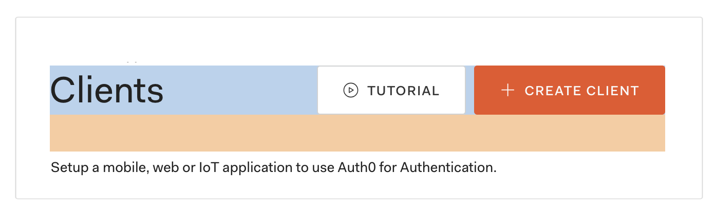
<PageHeader
  title="Clients"
  description="Setup a mobile, web or IoT application to use Auth0 for Authentication."
  primaryAction={<Button icon="plus">Create Client</Button>}
  secondaryAction={<Button icon="play">Tutorial</Button>}
/>
Behind the mechanical prop based API, there are a bunch of decisions hidden.
- Which element should be used for the header?
h1orh2? - Which action should come first, primary or secondary?
- What should be the color of the primary action?
- How much space should there be between the heading and the description?
- What should be the spacing strategy? marginBottom on the heading or marginTop on the description?
- What should be the tab order in the header — description first or actions first?
You see, it’s not just aesthetic decisions baked in, but also accessibility and layout.
This was great because it gives members of the design systems team a lot of time to spend on problems like loading and errors design for forms and accessibility of tooltips, which are incredibly deep rabbit holes and hard to justify spending a week on if you’re working a product. Unless, of course, that’s what your job is.
Back to the component library we built, it was great for the React developers, but when the documentation team reached out to us, we couldn’t really help them out.
They didn’t really need the components we built or have the same vertical rhythm as the application. Documentation pages usually have bigger fonts and a lot more white space than the compact application interface.
But the building blocks and feel of the brand was the same. We were able to share our tokens (variables) and building blocks with them (like Button, Paragraph, etc.) but they would still have to customize them to “fit in” to their app.
What about that one application that is using jQuery and everyone’s scared to touch it. It would have been great if we would have been able to share the generated css with them or have a common abstraction layer.
Around the same time, I saw this talk by Diana Mounter at Design Systems London where she spoke about this phrase by her co-worker:
Brand on a spectrum — Sophie Shoemaker
The idea is that their design system needs to power not just the GitHub application (which is very consistent and compact), but also the website and pricing pages and events like the GitHub Universe which might not follow the same grid or elements, but should still feel like it’s from the same company/brand.
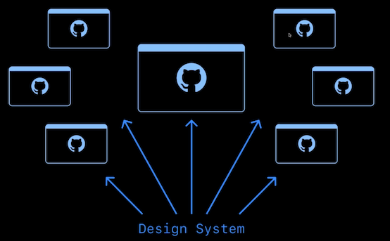
That got me thinking about layers of a design systems, we wanted folks to be able to tweak the component library without having to fall to a lower abstraction level and rebuild everything.
And this isn’t really new to us, clean code principles have been saying this for years. For example, you don’t want to create abstractions too early because that might lock you in (like it did with us), you want to keep things flexible.
Essentially, you have to design design systems.
Fast forward that story a year…
Now, I work at a 10 member startup, CodeSandbox.
Even with 5-6 people working on the frontend of the application, we are already seeing some of the problems that design systems can solve - design inconsistencies, duplication of similar elements, etc.
But,
If all you have is a hammer, everything looks like a nail — Abraham Maslow

At this stage, I really can’t justify spending all my time working on the design system, let alone creating a design systems team. But, I’d really like to start putting in the work in tiny bits that will help us now.
So, instead of thinking of it like a hammer, I have been thinking about it as a Swiss army knife which has many tools in it - which is a great analogy for all the small moving parts that go into building design systems.
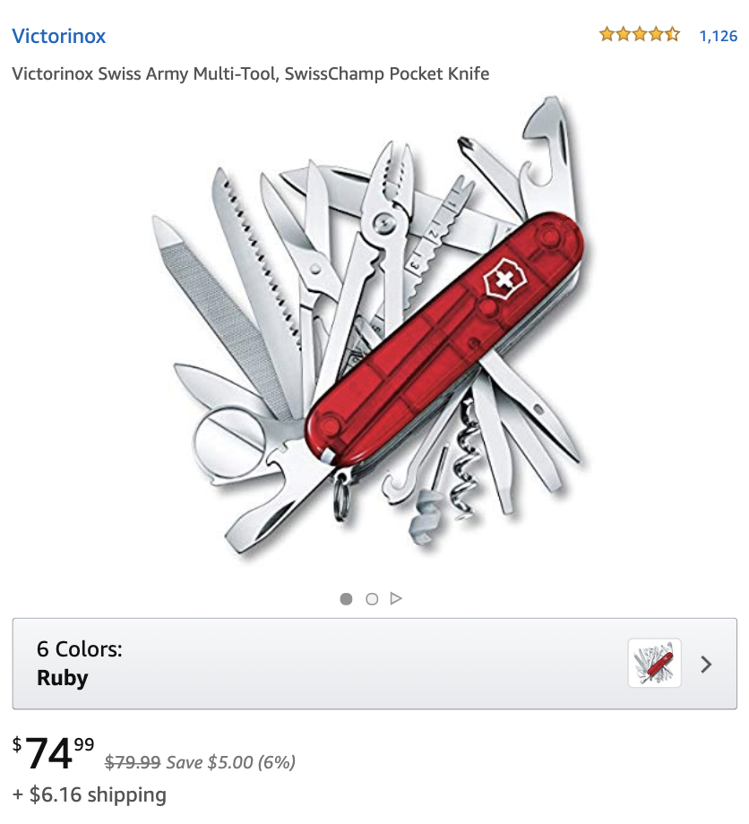
Like a set of tools that help with designing the design system - that can be shared by the team and integrated in our process.
I wonder what would you call such a thing? A system that helps you design design systems?
Design Systems design system.
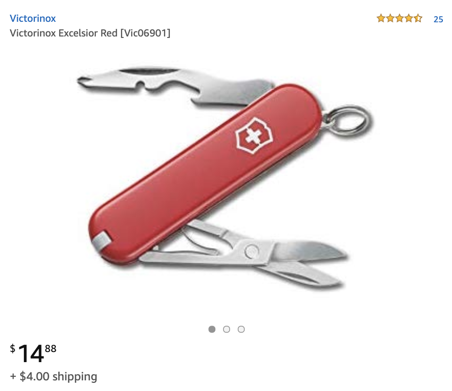
Now, we don’t need the the entire toolkit today. We can create create a smaller cheaper Swiss army knife.
The rest of this post is essentially ideas we can steal from the design systems ecosystem to improve our frontend applications.
Please steal these ideas from design systems
If there’s one thing you should steal from design system world, it’s tokens.
Tokens/Variables
For tokens, your tech stack doesn’t matter. You can write them for one stack in mind and port them for everything else.
We picked json as our base because the component library uses css-in-js, but then you can export them as css variables or xml for the android folks.
I highly recommend following a well defined spec for these. salesforce-ux/theo is a great one.
The one I like is system-ui, it’s the spec followed by styled-system and theme-ui.
It looks something like this:
const tokens = {
  fontSizes: [12, 14, 16, 20, 24, 32],
  space: [0, 4, 8, 12, 16, 20],
  colors: {
    blues: {
      300: '#6CC7F6',
      600: '#0971f1'
    },
    grays: {
      100: '#fff9f9',
      200: '#e6e6e6',
      300: '#999999',
      400: '#757575',
      500: '#242424',
      600: 'pink',
      700: '#151515',
      800: '#040404',
      900: '#111111'
    }
  }
}
You can import these into your React component and use it with your library of choice.
import styled from 'styled-components'
import theme from '../theme'

const AuthorName = styled.span`
  font-size: ${theme.fontSizes[2]};
  color: ${theme.colors.grays[700]};
`
It would be a chore to import theme into every file, we can make use of the ThemeProvider from styled-components.
import styled from 'styled-components'

const AuthorName = styled.span`
  font-size: ${props => props.theme.fontSizes[2]};
  color: ${props => props.theme.colors.grays[700]};
`
Did you know you can pass a top level function to styled, so that you don’t have to do it in every step?
import styled from 'styled-components'

const AuthorName = styled.span(
  props => `
    font-size: ${props.theme.fontSizes[2]};
    color: ${props.theme.colors.grays[700]};
  `
)
Nice, and maybe also destructure the theme:
import styled from 'styled-components'

export const Name = styled.span(
  ({ theme }) => `
    font-size: ${theme.fontSizes[2]};
    color: ${theme.colors.grays[700]};
  `
)
For the I like it up by using object styles.
import styled from 'styled-components'
import css from '@styled-system/css'

export const Name = styled.span(({ theme }) => ({
  fontSize: theme.fontSizes[2],
  color: theme.colors.grays[700]
}))
wouldn’t it be nice to remove this redundancy
import styled from 'styled-components'
import css from '@styled-system/css'

export const Name = styled.span(
  css({
    fontSize: 2,
    color: 'grays.700'
  })
)
import styled from 'styled-components'
import css from '@styled-system/css'
export const styles = {
Name: {
fontSize: 2,
color: 'grays.700'
},
Title: {
display: 'inline-block',
marginLeft: 3
}
}
export const Name = styled.span(css(styles.Name))
export const Title = styled.span(css(styles.Title))import styled from '@ds-tools/styled'
const PrimaryButton = styled.h1`
color: #d95988;
`
export const styles = {
Name: {
as: 'span',
fontSize: 2,
color: 'grays.700'
},
Title: {
as: 'span',
display: 'inline-block',
marginLeft: 3
}
}
export const styled(styles)New art: @ds-tools/theme.css
Remember shared and integrated
What else can be stolen? :thinking-face:
-
tokens + constraint based design
-
common base for css AND css-in-js AND design tools
-
usage across the org
-
the tools exist, prior art: theo, styled-system, theme-ui, this is just a remix
-
react-ui built with design systems design system (ds-tools + dsx) https://twitter.com/siddharthkp/status/1163369969804926976
TODOS:
- Publish a pretty readme for theme.css
- Publish a pretty readme for @ds-tools/primitives and react-ui
- Try to get a quick and dirty version of theme.figma
- Try to get theme.css to render styles from files