This is part of a series of posts about writing good components
No, this isn’t a post about child employment. It’s a post about using children as props. Wait that doesn’t sound right either. You know what let’s just look at an example.
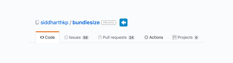
We have a badge component:
<Badge count={12} />You might see these sprinkled in different applications next to a label to show how many items are there inside - a number.
In cosmos, the Badge comes in multiple colors each for a specific context (information, danger, etc.)
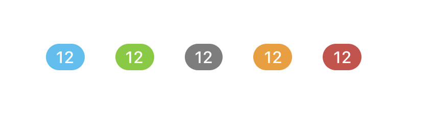
<Badge count={12} appearance="information" />
<Badge count={12} appearance="success" />
<Badge count={12} appearance="default" />
<Badge count={12} appearance="warning" />
<Badge count={12} appearance="danger" />
There’s another similar component in the above UI, the Label component
This too comes in multiple colors for each context:

<Label text="private" appearance="information" />
<Label text="private" appearance="success" />
<Label text="private" appearance="default" />
<Label text="private" appearance="warning" />
<Label text="private" appearance="danger" />
I want you to look at the two components and tell me one good thing and one bad thing about their API (props)

<Badge count={12} appearance="information" />
<Label text="private" appearance="information" />
Good thing:
Both the components have the same prop for their styling: appearance, that’s great. Not only that, they have the same options for that prop as well! If you know how to use the Badge, you know how to use the Label 🎉
Aim for consistent props across components
Bad thing:
The way they take their value is different. Both of them have their own way.
While count makes sense for the Badge component on it’s own, put together with all your other components, it’s a custom API that your teammates/users have to learn.
Let’s improve this API
To make them consitent, I’m going to name the prop: content, it’s the most generic name I could think of - more than label, text, value.
<Badge content="12" appearance="information" />
<Label content="private" appearance="information" />
We lost some visible detail but gained some consistency. We can still enforce the type of the value with prop-types, so I think that’s an okay trade-off.
But wait, React already comes with a multipurpose content prop, it’s called children !
Don’t reinvent props.children.
If you’ve defined props that take arbitrary input that aren’t based on a data structure, it’s probably better to use composition – Brent Jackson
Thats tip from this post - Prefer composition over props.
Let’s refactor that API with children:
<Badge appearance="information">12      </Badge>
<Label appearance="information">Private </Label>
Check it out, that looks great. 👌
Bonus: When you choose children instead of a text prop, the user of this component gets more flexibility without the need to modify the component.
Take this alert for example, I want to add an icon before the text.

With children, I can add an Icon in this alert without going back and changing the component.
// 👎 need to add icon support first
<Alert type="warning" icon="warning" text="This is an important message!" />

// 👍
<Alert type="warning">
  <Icon name="warning" /> This is an important message!</Alert>
Coincidentally, while I was writing post, I saw Brad Frost’s tweet:
Hey React friends, I could use some help. I keep running into this pattern where certain components (esp. lists) could be chunked out into smaller components, or managed by passing in an object. Is one way more standard or better?
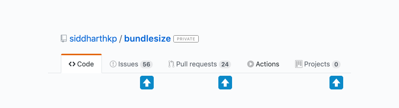
Looks familiar?
First of all, let’s not use a text prop and use children instead.
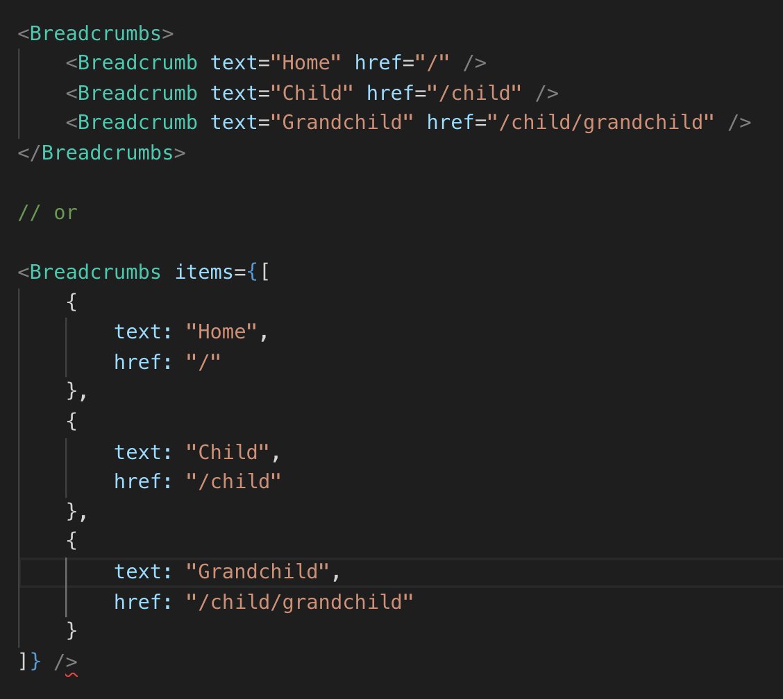
// instead of this:
<Breadcrumb text="Home" href="/child" />

// write this:
<Breadcrumb href="/child">Home</Breadcrumb>
Now that we’ve taken care of that, let’s talk about those two API options.
As you can guess, I like the first one.
-
You don’t have to think about what the prop is called - text? label? It’s just children.
-
You can add a custom
classNameortargetto it if you need to.For option 2, you’d have to make sure it either supports those properties or just passes along everything to the underlying element.
-
It enables the option of wrapping a child in a context wrapper or higher order component.
Exception to the rule:
What if Brad actually wants to restrict the developer from doing any of the customisations I mentioned above? The flexibility isn’t a feature for him, it’s a bug!
In that case, the second option is better because it locks down the features.
Here’s my reply to Brad.
More examples
Here are some more examples of how this tip can improve your code, the last one is my favorite.
Forms are a great use case, we want to control the layout of the form, how errors are shown, etc. But, at the same time, we don’t want to make it impossible to extend.
// #1 👎
<FormTextInput
  type="text"
  label="Name"  id="name-input"
/>
// where is that id going - label or input?

// #2 👍
<FormField>
  <Label>Field label</Label>
  <TextInput id="name-input" type="text" placeholder="What's your name?" /></FormField>

// #3 also fine 👍
<FormField label="Field label">
  <TextInput id="name-input" type="text" placeholder="What's your name?" /></FormField>
The last example is really interesting.
Sometimes you need a component to work in way too many situations. Trying to create a component that is very flexible but still has a simple API is hard!
This is where inversion of control comes in - Let the user of the component decide what to render. In React land, this pattern is called the render prop pattern.
A component with a render prop takes a function that returns a React element and calls it instead of implementing its own render logic.
from the React docs on render props
One of the most popular example of render props is the official Context API.
In the following example, the App component controls the data but doesn’t control how it is rendered, it passes this control to the Counter.
// create a new context
const MyContext = React.createContext()

// value is passed down by the context provider
function App() {
  return (
    <MyContext.Provider value="5">      <Counter />    </MyContext.Provider>  )
}

// and consumed by the context consumer
function Counter() {
  return (
    <MyContext.Consumer>
      {value => (        <div className="counter">the count is: {value}</div>      )}    </MyContext.Consumer>
  )
}
Notice anything interesting about that Consumer API?
Instead of creating a new API in the library, it’s using children to accept the function that will tell it how to render!
// 👎
<Consumer render={value => (
  <div className="counter">the count is: {value}</div>
)} />

// 👍
<Consumer>
  {value => (
    <div className="counter">the count is: {value}</div>
  )}
</Consumer>
How cool is that!
Here’s a call to action for you - Go back to your codebase and find that component that accepts a custom prop when it can easily just use children.
Hope that was helpful on your journey
Sid